


Education
Momentum unleashed
Positioning UCD Professional Academy with a bold new visual and verbal brand expression
Welltel is a leading enterprise communications group, sitting at the intersection between behemoths and middle-market players. Since 2007, Welltel has grown to over 230 employees servicing over 3,000 clients—with a product and services portfolio that spans the digitisation journey of its clients. Its fast growth is fuelled by a strong track record of delivering excellence. Its ambition: to be recognised as a trusted market leader in enterprise communications, delivering secure collaboration and customer experience internationally. A new name, identity and experience were essential to unlocking this growth while remaining united in purpose as a team.
SMART PEOPLE, NOT JUST SMART TECH
Welltel’s brand needed to shift to incorporate its growing portfolio of offerings to enable growth in the competitive telco marketplace, whilst creating a unified presence that will stand the test of time. A new and compelling brand was sought to enable it to move beyond the strictures of the telecoms category and stand out in a space traditionally dominated by old-style heritage utilities, localised arms of global players and start-ups.
From this positioning, we developed a new name: DigitalWell. This new identity reflected the depth and breadth of its expertise and aligned to its new vision as the organisation that clients love to work with, and employees are proud to be part of.
DIGITAL WITH ADDED HUMAN
The brand identity needed to be smart, ambitious, imaginative and modern. It is centred around the concept of customer centric, frictionless efficiency – made possible by a team of the best experts in the business.
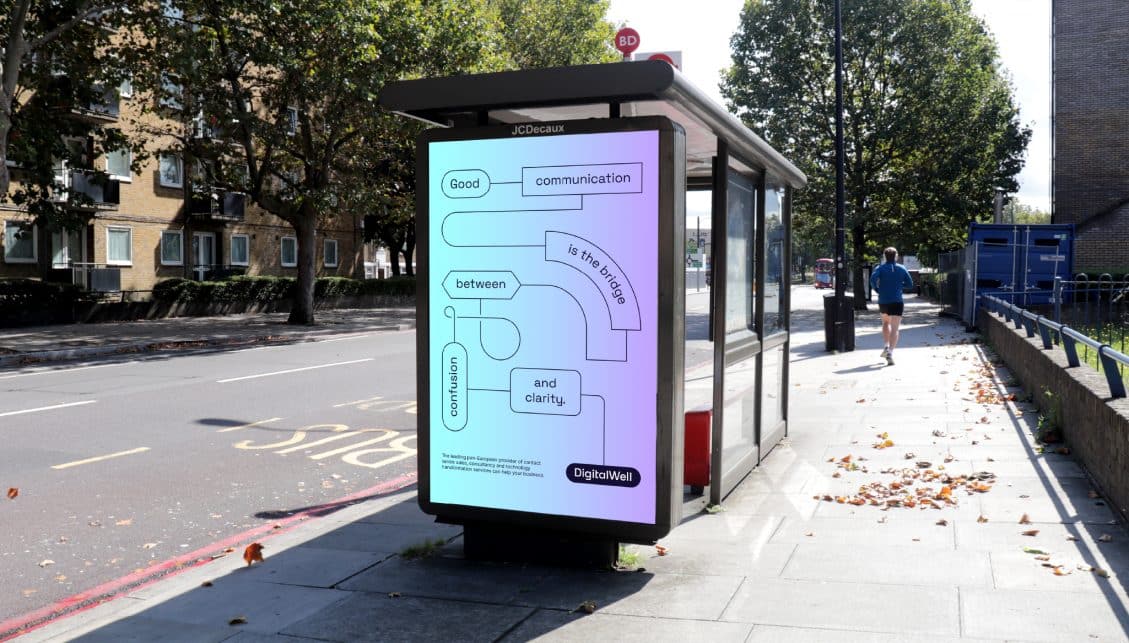
The flowchart visual device brings tech to the fore. Juxtaposed with photography that showed people engaged with technology to reinforce its client centric approach to delivering digital solutions.
The new brand language balances people and tech. Simple phrasing reflects the effortless experience of working with the specialist and integrated DigitalWell team.
Iconography clearly signals DigitalWell’s different service offers. The brand colours are bold and vibrant, while the use of the gradient stands out in the sector and provides an eye-catching device for use across digital applications.
A JOINED-UP EXPERIENCE
We implemented the new brand across core materials including motion, key templates, and stationery, with clear direction provided in a set of comprehensive brand guidelines.
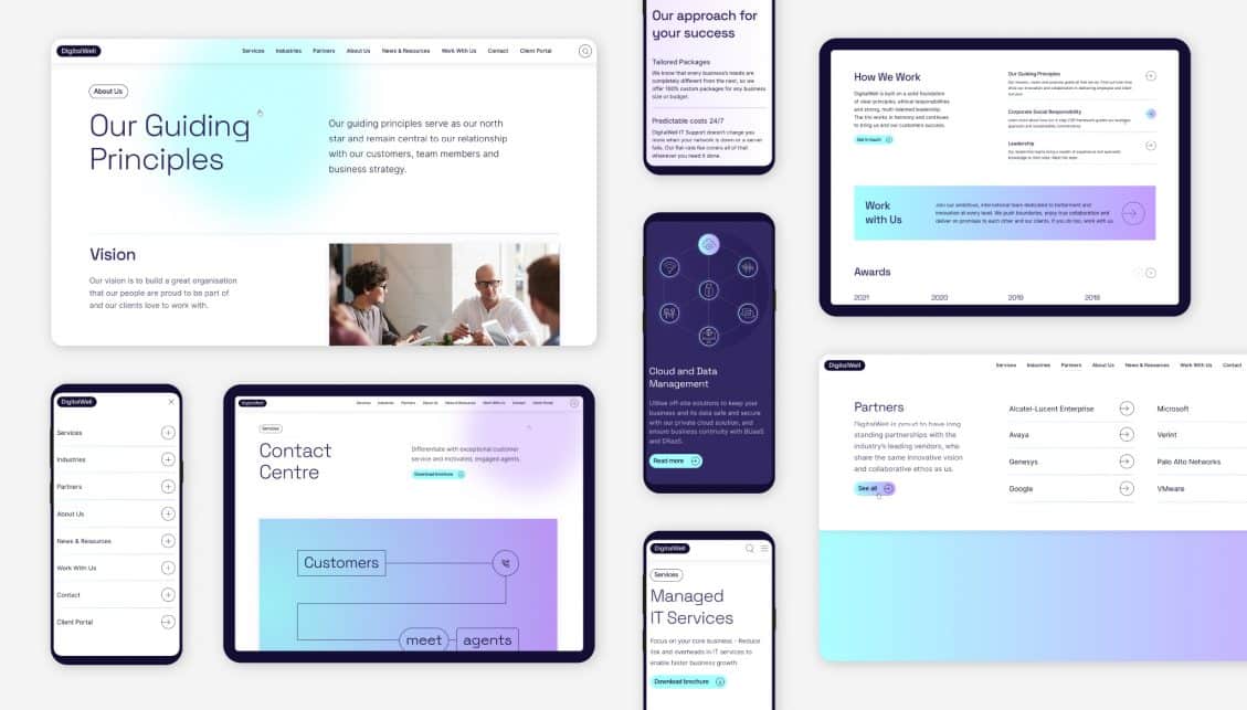
From here we were invited to continue to partner and develop DigitalWell’s new website, to act as a powerful cornerstone for the brand in a digital space. Working in close collaboration with the DigitalWell team, we created the website—from site map and wireframes through to specialist technical copywriting support, User Interface design and build.
The brand comes to life on the website through a frictionless user experience, clear CTAs, an easy-to-use CMS, accessible design and SEO optimisation. The result: a visually stimulating and effective lead generation platform that communicates without complexity who DigitalWell are today.